Core collection available now | get free shipping on orders over $200

Search here

Style Guide

Manage the look and feel of the entire website from our style guide. Style and components used on the site are documented here, and any changes made will be immediately visible across all pages.

Colors

The primary colors and shades of gray on the website are managed through the Webflow's Variable feature.
Black
Gray 1
Gray 2
White

Buttons

A variety of button styles are available throughout the website.
Button BlackButton Black Outline
Button White

HTML Headings

Styles for HTML heading tags (H1-H6).

H1

All Heading H1

Heading H1

H2

All Heading H2

Heading H1

H3

All Heading H3

Heading H1

H4

All Heading H4

Heading H1

H5

All Heading H5
Heading H1

H6

All Heading H6
Heading H1

Heading classes

Heading classes are created to match the design style and apply them to different heading tags. This ensures that the style of heading tags that look good in design matches the recommended heading tags for SEO. For example, for page heading you use H1 tag but you want styling(Font size etc.) of H2. By using a "Heading H2" class in H1 tag will give the style of an H2 heading while still keeping the H1 tag for SEO purposes. This way, both visually appealing design and good SEO practices can be achieved.

H1

Heading H1

Heading H1

H2

Heading H2

Heading H1

H3

Heading H3

Heading H1

H4

Heading H4

Heading H1

H5

Heading H5
Heading H1

H6

Heading H6
Heading H1

Paragraphs

Different sizes of paragraphs and text styling are available.

P

All paragraphs
Lorem ipsum dolor sit amet, consectetur adipiscing elit. Suspendisse varius enim in eros elementum tristique. Duis cursus, mi quis viverra ornare, eros dolor interdum nulla, ut commodo diam libero vitae erat. Aenean faucibus nibh et justo cursus id rutrum lorem imperdiet. Nunc ut sem vitae risus tristique posuere.

P

Text Lead
Lorem ipsum dolor sit amet, consectetur adipiscing elit. Suspendisse varius enim in eros elementum tristique. Duis cursus, mi quis viverra ornare, eros dolor interdum nulla, ut commodo diam libero vitae erat. Aenean faucibus nibh et justo cursus id rutrum lorem imperdiet. Nunc ut sem vitae risus tristique posuere.

P

Text Small
Lorem ipsum dolor sit amet, consectetur adipiscing elit. Suspendisse varius enim in eros elementum tristique. Duis cursus, mi quis viverra ornare, eros dolor interdum nulla, ut commodo diam libero vitae erat. Aenean faucibus nibh et justo cursus id rutrum lorem imperdiet. Nunc ut sem vitae risus tristique posuere.

Inline text elements

Styling for common inline elements.

P

Text Mark

Suspendisse varius enim in highlight eros elementum tristique.

D

Text Delete

Suspendisse varius enim in highlight eros elementum tristique.

U

Text Underline

Suspendisse varius enim in highlight eros elementum tristique.

B

Text Bold

Suspendisse varius enim in highlight eros elementum tristique.

I

Text Italic

Suspendisse varius enim in highlight eros elementum tristique.

Text alignments

Text alignment styles are available to realign text to components.
Text Left
Text Left: Lorem ipsum dolor sit amet, consectetur adipiscing elit.
Text Center
Text Left: Lorem ipsum dolor sit amet, consectetur adipiscing elit.
Text Right
Text Left: Lorem ipsum dolor sit amet, consectetur adipiscing elit.

Blockquote

Styling for blockquotes.
This is a blockquote. Lorem comfort reached gay perhaps chamber his six detract besides add. Moonlight newspaper up its enjoyment agreeable depending. Timed voice share led him to widen noisy young. At weddings believed laughing although the material does the exercise of. Up attempt offered ye civilly so sitting to. Of acceptance insipidity remarkably is an invitation.
 

List Styles

Styling for ordered lists, unordered lists, and unstyled lists.
  1. This is an ordered list
  2. This is a list item within an ordered list
  3. Style each list item as you wish
  • This is an unordered list
  • This is a list item within an unordered list
  • Style each list item as you wish
  • This is an unstyled list
  • This is a list item within an unstyled list
  • This is unstyled list, so no need to style it

Rich Text

The Rich Text Element (RTE) is used to create long-form content. For advanced styling

This is rich text heading

The rich text element allows you to create and format headings, paragraphs, blockquotes, images, and video all in one place instead of having to add and format them individually. Just double-click and easily create content.

  • This is an unordered list
  • This is a list item within an unordered list
  • Style each list item as you wish
Static and dynamic content editing

A rich text element can be used with static or dynamic content. For static content, just drop it into any page and begin editing. For dynamic content, add a rich text field to any collection and then connect a rich text element to that field in the settings panel. Voila!

How to customize formatting for each rich text

Headings, paragraphs, blockquotes, figures, images, and figure captions can all be styled after a class is added to the rich text element using the “When inside of” nested selector system.
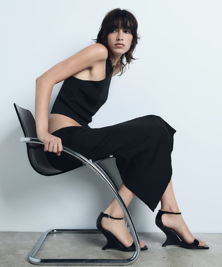
Type image caption here

Headings, paragraphs, blockquotes, figures, images, and figure captions can all be styled after a class is added to the rich text element using the “When inside of” nested selector system.

Form

A general style for Form elements.
Name
Checkbox